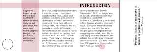
One of the main problems I found was the lack of colour to my swatch book. This is the development I took to make the whole thing a little better to look at.
Using yellow to brighten things up is a decent idea, but I feel the colour is better used to highlight key areas such as the title and opening paragraph. Used over the whole piece makes it look too overwhelming and it takes attention away from the main points.
Some experiments with ending symbols. Just an idea to distinguish the end of a sentence, but because each one is pretty much always one page it seems a little bit irrelevant.
These experiments explored angles and the effect they give to the piece. Although they do work in some situations, such as my typographic posters, they don't add anything to my swatch book design. In fact, they probably deflate the effectiveness as it's so distracting and gets in the way of text.
I decided to go with a light brown colour, to reflect on the colour of the parcel paper and to give a subtle highlight to the layout. I dropped down the tone of the text to 90% black to make it less overwhelming, and changed the title to a white to complement the brown more.
Below, I moved the symbol at the end of the piece to the start, and numbered them. It eases the eye into the text and makes it feel more like a publication. I tidied up the quotes by changing symbols and replicated the style on each page.


No comments:
Post a Comment