
I wanted a front cover that would match the style of the pages inside. I started by using the same colour that was used in the book, the easiest way to achieve consistency. I played around with weight, placement and the duplication of the colour to replicate the use of it in the book.


Reversing out the colours gave out a soft effect but I feel it wouldn't be readable when printed using these colours. I like how the shape wraps around the identity and intend to keep it that way. Maybe I need to use a dark colour to make the title clear.


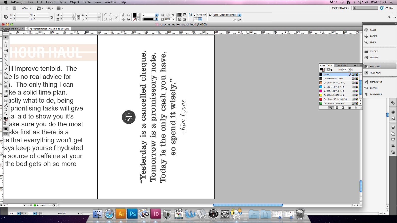

To heighten recognition, I included the logo with the quotes so there is something to relate to when the tear-off is no longer intact.
No comments:
Post a Comment