
Showing posts with label Brief 2 - Emotion in Type. Show all posts
Showing posts with label Brief 2 - Emotion in Type. Show all posts
Wednesday, 12 December 2012
Wednesday, 5 December 2012
300 Tweaks
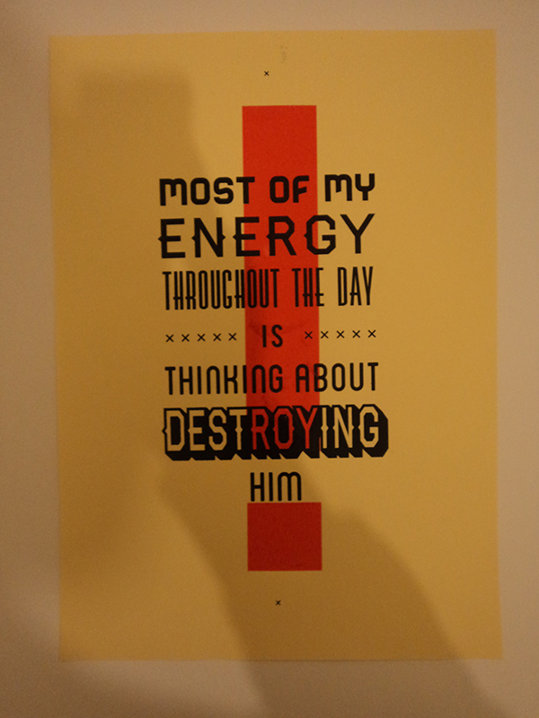
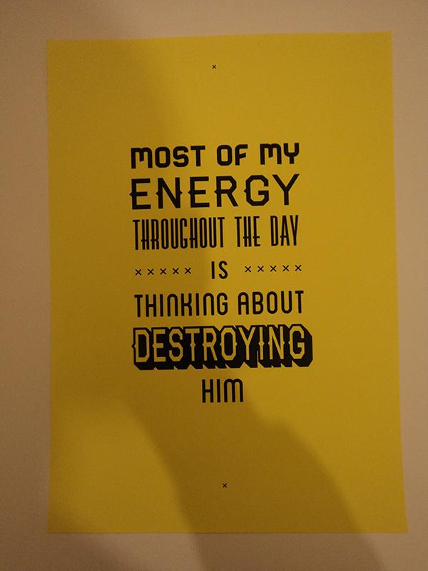
My 300 poster just didn't seem to be solid and courageous enough, this is my tweaks to my existing designs. I enhanced the message by adding the exclamation mark, and I think it also adds structure to the typography.


Some typefaces looked a bit off, such as the Avenir on the 'AN AGE OF FREEDOM', they didn't seem to complement each other that well. I made some final adjustments, and added the anaglyph effect on a darker background, as explored earlier:


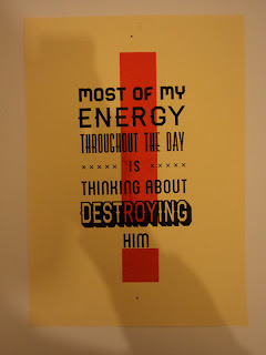
'Hate' Screenprints
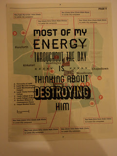
My hate screen prints have come out really well, I used two colours this time to emphasise the emotion. I printed on a range of stocks that would represent a wanted poster, and newsprint to mix it up a little. I think the brown sugar paper is the most successful, along with the red exclamation mark, as it reflects the wanted poster look and allows the black to sit nicely on the stock - whilst printing the red vibrant.


Friday, 30 November 2012
Hate Initial Development
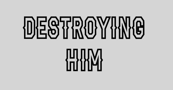
For hate, it had to be bold rugged and intimidating. I chose a range of typefaces that represented this and did a few experiments with it. I preferred the Haymaker typeface to highlight the main words, as I felt it had a wild-west quality to it - something you would see in wanted posters.
Here the development:
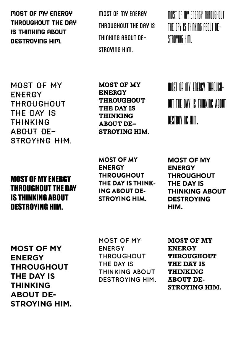


Here is the switch of composition, I felt that "Throughout the day... is... thinking about" read so much better than 'Throughout... the day is... thinking about' and it also helped to break the quote up nicely. I also tried adding the 3D effect on 'ENERGY', but I thought it took emphasis away from 'destroying', which I think is the most hateful word by far:


Subscribe to:
Posts (Atom)