Wednesday 12 December 2012
Tuesday 11 December 2012
Greetings Resolutions
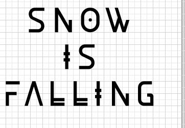
I took stock images of snow, and added some well known Christmas phrases around the theme of snow. The last one is a variation, making a positive of the early dark nights, which will be printed on black card.


---


Monday 10 December 2012
Final Infographic Development
Due to time constraints, I decided to focus solely on the American Psycho poster to get a resolved, considered outcome in terms of print and layout. The '300' development was not a waste, however, as it helped me experiment with data visualisation and develop solutions for this poster.
A collection of my final developments, with the construction of the final poster.
A collection of my final developments, with the construction of the final poster.


An example of an equation to work out the exact angle of a pie chart. This is for the rating - 67%. Works out as:
0.67 x 360 = 241.2
0.67 x 360 = 241.2
Introduction of a New Brief
I haven't chosen a competition brief as of yet, but I want to add an extension to my typeface brief using the UK Greetings brief of YCN.
http://www.ycn.org/awards/ycn-student-awards/2012-2013/briefs/uk-greetings#.UMggsZOLLol
My idea is, because I have a Nordic themed typeface, that I will focus on the theme of snow primarily. I will create a set of Christmas cards to reflect the concept.
http://www.ycn.org/awards/ycn-student-awards/2012-2013/briefs/uk-greetings#.UMggsZOLLol
My idea is, because I have a Nordic themed typeface, that I will focus on the theme of snow primarily. I will create a set of Christmas cards to reflect the concept.
Friday 7 December 2012
The 'Excitement' Chart
After the final crit, I found my infographic brief to be the one that needed the most work. The work I had wasn't set for a final print, and I needed to rectify this immediately.
Instead of just doing facts, I think it would be interesting to do some statistics of my own opinion. Based on my transcript of the film, I'll plot a continuous line graph that will let users know what parts of the film are worth watching.


Instead of just doing facts, I think it would be interesting to do some statistics of my own opinion. Based on my transcript of the film, I'll plot a continuous line graph that will let users know what parts of the film are worth watching.


I tried working with the circular format until I started developing the 'excitement chart'. The circles simply weren't working, there was too much information to store in one place, I needed to explore a different type of infographic for this one. Below is the initial development of the excitement chart.


Thursday 6 December 2012
Development of Final Publication
I think the best way to document the progress of the final publication is to save the whole thing as a PDF. Unfortunately, I have only realised this as of now, so the first example is already quite developed. This method will be used in the future though, to explain the process in the best way possible.


Made space for imagery, broke up the publications into sections
Started to add imagery
Added the play off section, and looked at the Super League Logo
Filled in the blanks, added acknowledgements, reduced point size and rectified any minor details
Wednesday 5 December 2012
300 Tweaks
My 300 poster just didn't seem to be solid and courageous enough, this is my tweaks to my existing designs. I enhanced the message by adding the exclamation mark, and I think it also adds structure to the typography.


Some typefaces looked a bit off, such as the Avenir on the 'AN AGE OF FREEDOM', they didn't seem to complement each other that well. I made some final adjustments, and added the anaglyph effect on a darker background, as explored earlier:


Final Tweaks
There are some inconsistencies within my typeface at the moment, which I am aiming to iron out for my final outcome. Also including glyph considerations.:
Final Crit - Feedback & Response
Overall, I think I have a lot of work to produce for the final hand in. I think I have been in the finalising stages for too long, and although I have had a good chance to develop, it would have been nice to have some finals ready to show in the final crit - printed & trimmed - rather than my final work on standard mac suite stock.
However, general consensus suggested that my blog was acceptable, so I won't need to spend much of my time catching up with that.
This is my action plan for this week:
Finalise my Rugby League & Best of Films work
DEADLINE - Thursday 11PM
Spend Friday printing out any work that I have, visiting the drop in digital print room.
The weekend will consist of catching up with whichever areas of my blog I have missed, finalising any other work that I will need to complete. Printing everything else on the Monday morning and dedicating the rest of the day to photograph prints, preferably before 3:00PM when it gets dark.
From there, I only need to construct my final boards, adjusting any weaknesses highlighted today, and to make sure my blog is perfect for hand-in.
Best get to it then...
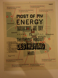
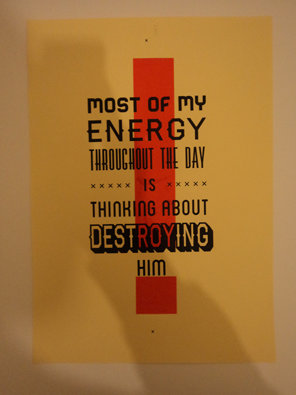
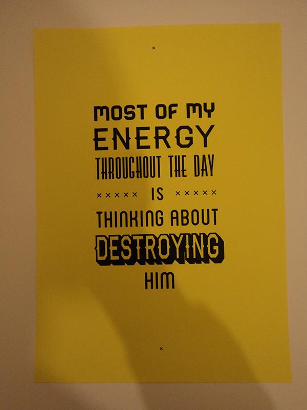
'Hate' Screenprints
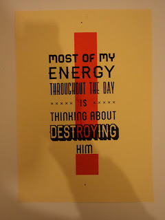
My hate screen prints have come out really well, I used two colours this time to emphasise the emotion. I printed on a range of stocks that would represent a wanted poster, and newsprint to mix it up a little. I think the brown sugar paper is the most successful, along with the red exclamation mark, as it reflects the wanted poster look and allows the black to sit nicely on the stock - whilst printing the red vibrant.


Subscribe to:
Posts (Atom)