
Showing posts with label OUGD202. Show all posts
Showing posts with label OUGD202. Show all posts
Wednesday, 8 February 2012
Constructing My DVD Packaging
This is my finalised packaging that will be handed in on deadline. The concept is pretty clear, a gold medal that can be worn around the neck via ribbon. I measured the DVD, 119mm diameter, and printed out a gold circle in this size - with the title and olympic rings clearly displayed. I then placed the ribbon inside the fold of the case and connected it via double sided sticky tape. A simple concept that clearly shows my theme.


Tuesday, 7 February 2012
'10 Things' - Final Title Sequence w/ Idents
Subtle changes to the title sequence, added a fade in from black effect and lowered the volume to -3db to avoid any distortion. Reverted back to the style of my initial idents, they involve the rings a lot more and give more movement - promoting interest.
---
Progress: 06.02.2012
Here are my set of animations, ready to burn to disc, for the presentation. I stuck to the 5-colour repeat of the Olympic rings, with the opening and closing of the title sequence. The opening space was a mere 36 frames long - extremely tricky to fill, but a simple way to open up the minute. When the pace dies down in the last 9 seconds of the sequence, I decided to go for the 'rotating rings' approach I had used in my idents. This kept consistency, whilst being a fitting way to match the soundtrack - and to transition into the final, solid, title.
TITLE SEQUENCE
TITLE SEQUENCE
---
IDENTS
---
Saturday, 4 February 2012
Storyboarding: 36 Frame Space

So far, I have only had experience storyboarding for 5 seconds or longer. Although 5 seconds is a short amount of time, it is only 125 frames, I have a shorter amount of time that needs filling at the start of my title sequence - 36 frames.
Rather than avoiding the problem and shifting the music, I think it would benefit my practice if I work out a way of filling in the space. I also think the beginning also helps to ease into the soundtrack - so I see scrapping it as a null option.
I want to have the olympic rings, staying true to the style, in this small piece of animation. Here are some storyboards demonstrating fade in & out effects, small movements & rotations and zooming into the piece.
Progress: 60 Seconds From 03.02.2012
The blank space is where I need to add an intro and outro to the piece, but the core of the animation has come to a good point. Comparing it to my first draft, where I added an initial template, I think the whole thing has a quicker pace by repeating the same illustrations in different stages along the timeline. It adds a better build up, and reflects on the more apparent beat towards the end of the track.
To accommodate for the change of approach in the animation, I needed to axe one of my nine illustrations. This enabled me to fit eight in comfortably, without forcing the extra one into my work. Out of all of them, I felt the one with Derek Redmond and his father, timed at 00:35 on my initial template, was the weakest image. Only the top half of the body was visible, and was probably the hardest to make out.
I swapped Dick Fosbury's illustration to green, as it is the more visible colour out of that and yellow, and added kinetic lines. This was a response to my ident, but was simplified by keeping a consistent path. The change of direction was just there to add more movement to the animation, and after watching Sean Berg's logo animations, I came to the conclusion that simplicity was the key approach. It keeps the whole thing concise, and less distracting for the viewer.
I swapped Dick Fosbury's illustration to green, as it is the more visible colour out of that and yellow, and added kinetic lines. This was a response to my ident, but was simplified by keeping a consistent path. The change of direction was just there to add more movement to the animation, and after watching Sean Berg's logo animations, I came to the conclusion that simplicity was the key approach. It keeps the whole thing concise, and less distracting for the viewer.
Friday, 3 February 2012
Timing My Video To The Music
I had only concentrated on one ident so far, so I thought it would be a good idea to piece together my 60 second introduction, and base my remaining idents on samples from this. I started by collecting all my illustrations together and timing it with my soundtrack: Kasabian - Re-Wired. Here are the results:
I had noticed, once I uploaded and spent another half an hour on my project, that I forgot to enable audio. Silly mistake, but although this doesn't give a true representation of my initial 60 second intro, the pace can still be established and it sets a template to work on.
RESPONSE TO LORRAINE'S FEEDBACK
I had scrapped the Spitz illustration and opted for Michael Phelps, also in my top 10, on a side-on angle. (00:20) It is much clearer what is going on and communicates the idea of swimming much effectively. I will use this as a replacement in my ident.
RESPONSE TO LORRAINE'S FEEDBACK
I had scrapped the Spitz illustration and opted for Michael Phelps, also in my top 10, on a side-on angle. (00:20) It is much clearer what is going on and communicates the idea of swimming much effectively. I will use this as a replacement in my ident.
Wednesday, 1 February 2012
Post-Crit Changes
- Deepened the colour blue, to prevent it looking like the winter Olympics, and relating closer to water.
- Slowed down the rotations of the rings when the channel identity shows up.
- The pulse is weaker to prevent distraction.
- Created splashes around the character to enhance the look of him swimming.
- Put a blend layer on the character to give him relation to the background.

---
Idents For Crit: 01/02/2012
(first ident w/ audio and channel identity)
(initial animation)
(60 second soundrack w/ pulsing rings)
Final Illustrations
My final illustrations to be used with my animation, displayed on a green background for maximum visibility.


---


---


---


---


---


---


---


---


---
Final Backgrounds
Final backgrounds, all representing the colours of the olympic rings. The blue has a grunge effect to represent the water, where I will put my illustration of Mark Spitz.


Tuesday, 24 January 2012
Aftereffects: Session 5
New techniques to be learnt today:
To do this, go to Animation > Keyframe Assistant, and select either ease in for acceleration, and out for deceleration. If the object has to be eased in and out, the 'easy ease' option will apply both. Below is a demonstration; the green square is eased out, blue eased in and the grey eased in and out. The red stays at a constant speed for comparison purposes:


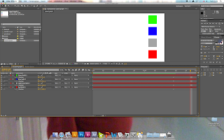


Additional KeyframesPressing 'U' opens all animated properties of the composition. At the moment, all squares move across the screen from left to right at a constant. To apply acceleration and deceleration, the keyframes have to be eased in and out.
Simplifying composition
Grouping
Adding sound
To do this, go to Animation > Keyframe Assistant, and select either ease in for acceleration, and out for deceleration. If the object has to be eased in and out, the 'easy ease' option will apply both. Below is a demonstration; the green square is eased out, blue eased in and the grey eased in and out. The red stays at a constant speed for comparison purposes:


---
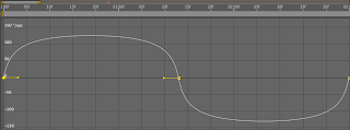
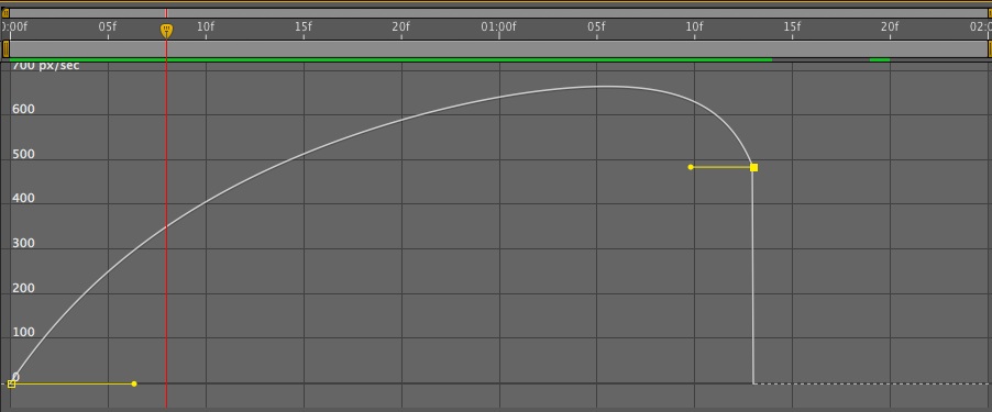
THE GRAPH EDITOR
On the toolbar at the top of the layers menu, there is a 'Graph Editor'. This demonstrates acceleration and deceleration in more depth, and allows custom changes to be made:

(constant speed)
(acceleration)

(constant speed)


---
SWINGING THE PENDULUM
Using the ease in and ease out technique, we had an exercise to emulate a swinging pendulum. We brought the black layer into the composition, and doble clicked the eclipse tool to add a mask to the solid. By pressing 'Y' it is possible to adjust the anchor point, ready for rotation.
By adding three keyframes, rotated -80, 80 then -80 again it will rotate the shape around the anchor point at a constant speed. Going to the graph editor and selecting the speed graph will allow the customisation of the ease in and out technique. Once tweaked, there is a shape that will accelerate to 0 degrees, and decelerate on 80 and -80. Demonstration below:


---
ESTABLISHING PARENT CHILD RELATIONSHIPS
When there is a parent child relationship, the child can move individually, but it is always bound to the parent layer. All properties apart from the opacity layer.
When creating a path for the layer, 'Auto-Orient' allows the object to move with the curves. The 'rove over time' option disregards that keyframe in the timing, making it easier to create flowing movement.


---
---
Another way to group objects together is to make a whole composition, simplifying the timeline of the key project. Layer > Pre-compose does this.

---
.aiff or .wav are the best audio files to use within AfterEffects. MP3s can be exported in Quicktime 7.

When exporting to .mov in AfterEffects, make sure the 'Audio Output' box is ticked.
Subscribe to:
Posts (Atom)