Monday 28 February 2011

Opposites Typographic Poster - Initial Development.

Opposite - Black & White
Theme - Hidden Messages
Concept - Printed Set


This development uses the hatred of Comic Sans to portray a message (in white) but hiding the bigger message in black.  I started by looking at fonts and what they communicate, before using one to help in my message, with colour - one false, one humorous and the true statement.  I think it is a clever way of putting something forward with hidden meanings and different interpretations.

Sunday 27 February 2011

Hot Dog - First Draft

I like think my first draft came out well, but I didn't like the vectored squares based around the squares in the photos.  It didn't really relate to the theme and looked out of place, so I went out to take an image to use for the poster.  I got a picture of a cat's eye and gave it a fresh green colour via Photoshop.


Thursday 24 February 2011

Book Development - Part 2


These experiments have used what I have learnt in the first development, and added to it in this one.  I coloured in specific areas and altered the levels of the colours, as well as adjusting the levels and exposure as in the previous experiments.

Book Development - Part 1


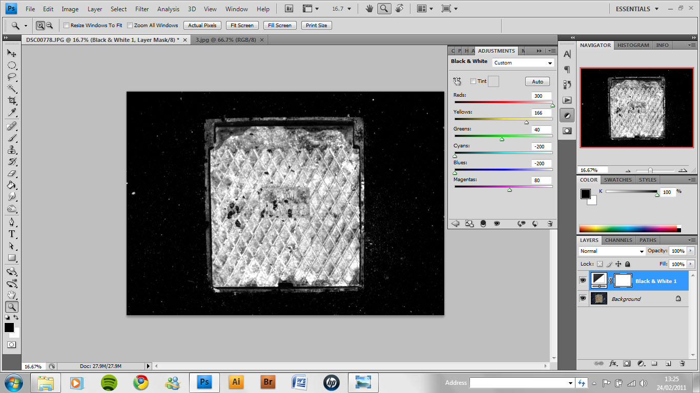
Here I made adjustments to the Black and White adjustment layer.  The bright white effect it gives off looks very urban and grimey.


Experimentation with the Colour adjustments, here is a sepia effect that unfortunately doesn't add much to the image.


Experimentation with the curves brought back the bright white effect, but less grungy.  Messing with the Levels feature brought back that grungy, urban feel.


All these are variations of the Hue/Saturation.  I wanted to see if I could get anything from a different coloured grate, and the last test looks grungy in its own way.


I experimented with vibrance and exposure, and found that exposure gave an urbanised look to the image.


I duplicated the grate and used the transform tool to experiment with rotation.  I used layer styles to overlay the duplicated image with the original.  The effect the second experiment gives off is really urban and goes well with my personal brief.


I coupled this with exposure and other layer styles to add to this grungy look.

Wednesday 16 February 2011

End of Module Evaluation - Design Process


Final A1 Piece - Printed and Displayed


This is my final A1 piece, printed and showcased by Flanagan and Will.  The second picture gives a better understanding of scale, and perhaps it would have had a more 'gigantic' feel had it been in A0.  That been said, it could have made it too big for the average wall and could have had a negative impact.  So overall, A1 was a nice size to work at, and the stock used has really brought out the colours nicely.

Final A3 Posters

 2 mini leads, 10 plectrums
 2m Guitar Lead
 Set of Strings
 Guitar Tuning Device
Mini Amp

These A3 posters are the gateway to obtaining the final collectable A1 100 piece.  The idea is, these posters will be distributed to all leading guitar stores in the country, and included in special offers on guitar equipment. For example, poster 1 is included in the 2 mini leads and 10 plectrums deal and the poster 5 is included with the mini amp.  These are just examples, it can be very flexible.  There could be numerous deals on for each poster design.

This centres my project around my target audience, and I would hope that it would boost sales and the appreciation of guitars in general.  It makes my project collectable, and stays true to the Product and Promotion that I chose to do at the start of the brief.