Thursday 26 May 2011

End of Module Evaluation - OUGD103


This shows me punching a hole in my finals and binding them.  The main problem was the binder was too thick so protruded out too much.  Next time I would trim down.  The paper used was probably a bad choice as it didn't slide well so I would print on a glossier surface.

I perforated the cut outs manually using a scalpel, they give off the same effect as using a device for this, so it wasn't too bad.


Cutting the Finals

This is the process I took from printing out my book and cutting them out.  I printed on cartridge paper which was a thicker stock that the usual paper I used before, but I found the ink would smudge quite easily which was a bit of a problem.  The envelope came out fine once I widened it on illustrator.


Front Cover Development

I wanted a front cover that would match the style of the pages inside.  I started by using the same colour that was used in the book, the easiest way to achieve consistency.  I played around with weight, placement and the duplication of the colour to replicate the use of it in the book.


Reversing out the colours gave out a soft effect but I feel it wouldn't be readable when printed using these colours.  I like how the shape wraps around the identity and intend to keep it that way.  Maybe I need to use a dark colour to make the title clear.


To heighten recognition, I included the logo with the quotes so there is something to relate to when the tear-off is no longer intact.

Guide Development

One of the main problems I found was the lack of colour to my swatch book.  This is the development I took to make the whole thing a little better to look at.


Using yellow to brighten things up is a decent idea, but I feel the colour is better used to highlight key areas such as the title and opening paragraph.  Used over the whole piece makes it look too overwhelming and it takes attention away from the main points.


Some experiments with ending symbols.  Just an idea to distinguish the end of a sentence, but because each one is pretty much always one page it seems a little bit irrelevant. 


These experiments explored angles and the effect they give to the piece.  Although they do work in some situations, such as my typographic posters, they don't add anything to my swatch book design.  In fact, they probably deflate the effectiveness as it's so distracting and gets in the way of text.


I decided to go with a light brown colour, to reflect on the colour of the parcel paper and to give a subtle highlight to the layout.  I dropped down the tone of the text to 90% black to make it less overwhelming, and changed the title to a white to complement the brown more.

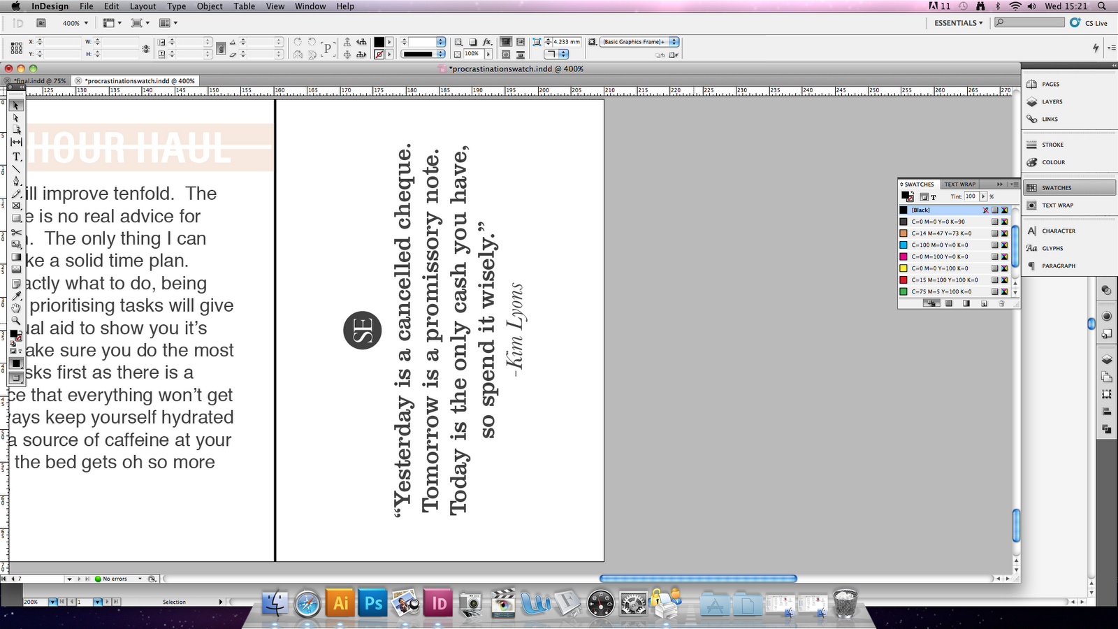
Below, I moved the symbol at the end of the piece to the start, and numbered them.  It eases the eye into the text and makes it feel more like a publication.  I tidied up the quotes by changing symbols and replicated the style on each page.