Tuesday 29 March 2011

Initial Silhouette Ideas

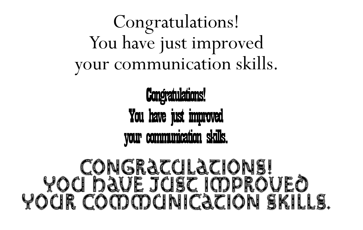
Based on my research, and my negotiated brief, I have come up with a few ideas that communicate my concept.  I have considered the possibilities of cutting (i.e. filling in counters) and demonstrated a 2D and 3D hybrid in response to Peter Callesen.

I have focused on typography with these, whereas it should be a second thought to complement the design.  I need to look at imagery and how to make silhouettes with complicated images such as landscapes.

SEE:

Monday 28 March 2011

Final Postcard Designs


These are a couple of the final postcard reverse designs.  I have responded to the work that I researched that separates the two sides of the card with text, instead of a line.  This gave me a chance to add the original quotes on the piece in a practical way.  I decided to insert the reading facts in the bottom left as it prevents any clashes with writing, yet is still visible enough to make an impact.

SEE:
Postcard Research - Backs
Facts About Reading

Thursday 24 March 2011

Development of Postcards - Back


The key to designing the backs were to keep it simple and relevant to the brief.  I included the reading facts that I had researched to keep it informative and showing the viewer the benefits of reading.  I wanted to inform the viewer in the same way that a dictionary does, so I portrayed this in the same way.

SEE:

The Day After...


Thursday 17 March 2011

In Design Week 2

More notes:


  • If you're working with transparency (no background) in photoshop, the PSD will still keep the effect in the InDesign work.
  • The transparency can be used in the text wrapping - set the Contour Options to the Alpha Channel.

Tuesday 15 March 2011

Experimenting with Type

These are experimentations to compare and contrast the typefaces that best relate to reading and would be suitable to be used as a stencil.  After analysis, I think the serif typefaces represent books well, yet aren't too complex to be cut out.

Manipulating photos with type