Showing posts with label What is a Line?. Show all posts

Tuesday, 26 April 2011

Final Cuts

These are my most successful attempts coming from the laser-cutting session, and certainly give a better quality than my scalpel work.

If I were to do this again, I would make sure there is a bounding box around my images to make it easier to centre on the page.  I would also consider flipping the image when taking into the laser cutting process, as I found the reverse side was slightly neater.

My final two contrasting images, Nightfall and Summer Time, came out really well.  Nightfall was created all on illustrator so I had no need to experiment, but the Summer Time piece was developed on the cutting machine from raw vectors.  I firmly believe the laser cutter is a great tool to use for experimentation, providing there is a variety of images to work from.


Laser Cutting - Experimentation

I put my induction to good use and booked myself in for a laser-cutting session to produce some final cuts.  I had some troubles, at first my illustrator files wouldn't import, but eventually got used to how the machine worked and I feel that there is huge potential in not only this, but future briefs.

I took Matt's advice and used it more as a tool, so I went into the session with mostly raw images.  I placed them into APS Ethos and made completely original cuts based on my previous experiments with the scalpel.


This is a design that has just been cut, when I lifted the lid.  The laser is powerful and doesn't fail to give a clean cut to the images, which makes for outstanding quality.


I set the origin wrong in my first attempt, the right side was extremely flimsy.


My first experimental piece resulted in the legs of the emu being cut as there was nothing to hold them in place.  I placed it further up and made it slightly smaller in my next attempt, and there were no problems the second time round.


These were my most unsuccessful attempts, but it taught me about the importance of a bounding box in illustrator.  They were just floating images, so I had to set the origins manually.

Monday, 25 April 2011

Mixing up Silhouettes

I liked the feel the emus gave to the longboat silhouette, and I revisited this here.  I feel it is a little flat, so I combined it with my tree design to add depth.  I cut the emu shadows out of the stencil, paying attention to distance, and traced them into the silhouette itself.

I reapplied the Peter Callesen effect but the black stock doesn't crumple very well, leading to tears.


Working on Black Card - Final Silhouette

This shows why I reversed my print and the importance of stencils.  It doesn't leave any glued paper, even on the back, and allows for a smoother cut because there is only 1 material to cut through.


This is the process of choosing the bird for this experiment.  I didn't want the goose as I had used it in my previous ones.  I chose the duck to see if it gives a different effect, cut it out of the stencil and traced it onto the black paper.


This is how my stencil interacts with negative space, the black blocks out the light beautifully.


Sunday, 24 April 2011

Digital Development - The Construction Site

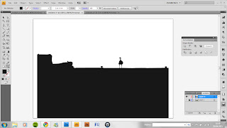
I decided to build on the idea of implementing birds into my silhouettes, by starting with a fresh photo.  Most of my photographs I have worked on thus far are naturist in some way - they include trees, flowers and water and don't represent urban life.  I chose this image as it shapes and interesting skyline, a strong foreground image and depth - something I could challenge myself to implement into a flat silhouette.

[original photo]


One difference in the design compared to my previous experiments is the stock and negative space.  I switched them round as the fencing and the sky would be harder to connect together otherwise.  Although I was forced to do this, I was pleasantly surprised by the results.  It gives off a darker vibe, as though it's set during the night, and gives a better perspective of foreground and background.  The effect actually shows the depth of the image, and gives room for more content above the fencing area.


As I started to in previous development works, I started to include birds into the design to create a consistent theme.  The first bird is actually a goose, but looks sinister and dangerous with the arch of the neck - like an eagle or vulture.  It fits the mood of the design and complements the night of the silhouette.

I included two more birds to see if they brought a similar effect, but to no avail.  The bird on the roof also looks too big as it is, and would be very fiddly to cut.  In addition, the gaps between the legs would have to be filled in.


I included some text to label the piece, as well as a full moon to enhance the eeriness of the silhouette.  I experimented with the layout and flipped the design ready for print.  I did this so I could glue to the back of the card and get a clean outcome on the other side.

Digital Work - Bridge and Longboat

These are more skyline silhouettes to give me a broader library of images, both different in their own right.


[original photos]


My first experiment was on the bridge, but offered no development opportunities as it was already so three dimensional and there was limited space left.  Also, the trees at the top looked very complex to cut out and would be likely to snap off in the process.  As a silhouette it is not really distinguishable and therefore makes for a poor design.  I decided to move on to the next photo.


The longboat photo was great for being two dimensional and allowing room to add extra content; in this instance birds.  Considering scale, I experimented with what the birds added to the image as part of the skyline, and got an interesting outcome.

Although it brings the silhouette to life in a way, the width of the legs make it a bad cutting choice.  It would be extremely fragile and prone to tearing if I cut out these designs.  However, I will experiment with this idea on the cutting board as there is a lot of room to place content in the silhouette.

Wednesday, 20 April 2011

Illustrator - Tree Experimentation

[original photo]


I started by making a silhouette of the statue image, ignoring any of the background features.  The image in itself is fairly simple, but the tail could be a problem when it comes to cutting as it seems thin and fragile.  If this is the case, I will just strengthen this area by making it thicker.


Above are the experiments I carried out using the roughen, pucker & bloat and free transform tools to gain a tree-like effect.  The first effect looks the most straightforward to cut and wouldn't pose too many problems in this respect, but none of them are a definitive tree.

In addition, I think the original silhouette is stronger as the trees block out the book and part of his leg, which hinder the visual recognisability of the main subject.