
Showing posts with label Brief 3 - Nordic Typeface. Show all posts
Showing posts with label Brief 3 - Nordic Typeface. Show all posts
Wednesday, 12 December 2012
Wednesday, 5 December 2012
Final Tweaks
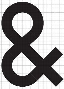
There are some inconsistencies within my typeface at the moment, which I am aiming to iron out for my final outcome. Also including glyph considerations.:
Monday, 3 December 2012
Tuesday, 27 November 2012
Friday, 16 November 2012


Thursday, 15 November 2012


Tweaking Inconsistent Letterforms


---
I did a few tests with my typeface and this is what I found to be problematic. The bowls were too big on the R and the P letterforms, the bar was too low on the original E and F, and the S didn't look straight enough. Here is how I quickly rectified this, keeping to the consistency of the typeface.


I felt the letterform stretched too far, although it was technically in line with the rest of the typeface - visually it didn't look consistent. I trimmed the arm back slightly and raised and extended the bar to make the letterforms look more uniform.


Here are a few experiments with the bowl's curve - making it less rounded to keep with the visual style of the typeface.


Previously, I think I overcomplicated the S by trying to make it too rounded - I simply straightened out the spine of the S to simplify the letterform.
---


---
EDIT: To make the O look visually correct, a slight vertical increase has to be made, which will send the letterform above the base line and cap line.


Developing My Own Typeface


The typeface is based on Univers, in terms of size and aesthetics. I want the letterforms to be as simple as possible, keeping the consistency that is required in a typeface, ready for manipulation in the style of the Futhark alphabet. I have tried to keep the letterforms around a width:height ratio of 5:8, but of course there needs to be exceptions in wider letterforms such as M and W.
Above are documented developments of letterforms that needed tweaking, some of the problems that I came across were:
- Diagonal aspects of a letterform, such as the linking bar on the N, looked visually thinner when sticking to the grid - these needed quick tweaks.
- Working to a smaller scale proved difficult when trying to centre parts of the letterform, such as the bar on the E. By doubling the size of the letterform, effectively making the grid smaller, this was able to be rectified.
- It was difficult to make the top of the G look accurate to the bottom, which was solved with a curve to finish off the letterform. Consequently, the C had to be altered in this way to remain consistent - although I believe it looks visually stronger and takes advantage of the geometric theme of the typeface.
Here is my first rendition of my typeface, keeping consistency with the C that I originally created:

Subscribe to:
Posts (Atom)