
These two experiments were purely abstract. For the first one, I simply dropped the ink onto the paper from a height to give a splatter effect. The lines made look shaken, and emphasises fear. The second piece started out with a drop of ink on the page. It was blown around the page with a hairdryer, demonstrated below. This created unpredictable, quick, messy lines that reflected my word.
I created this letterform with a blob of ink, and a stem coming off it created by blowing through a straw. Once I got the basic shape, i took the paper and shook it in different directions, which made the ink run to create this messy, shakey pattern.
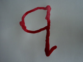
After researching some ink-work, I decided to try some in the Alphabet Soup project. I started simply, by using a straw to mark out a simple letter 'q'. Using the same straw, I blew the lines away from the shape to produce an aggressive, rebellious letterform. It relates to 'shake' by producing the fear that would make someone nervous, uneasy. Although the letterform itself isn't shaking, it is capable of making it happen.


 For this experiment I dropped a small amount of ink on one side of the page and shook the paper around. I folded the paper in half and smudged it to the other side, making the ink patterns inconsistent and 'shakey'.


