Showing posts with label Alphabet Soup. Show all posts

Thursday, 18 November 2010

Illustrator Finals

My final resolutions for the Alphabet Soup - Illustrator brief.  I experimented with the tools available on illustrator, a spot colour and opacity.  I think my experiments with the counter are the most effective as they look original whilst staying legible.  I do, however, think some of my experiments are bordering on legible, with the various swirls and distortions I have added. 

Illustrator Experiments


Here are some experiments I did before I concluded my final piece.  The red and black show how I created a hybrid font by combining Helvetica and Hobo Std.

Friday, 15 October 2010

Initial Ideas For Ryan


My ideas were to combine the reserved and ambitious traits to create a hybrid font, shown in my initial experimentation.

Thursday, 14 October 2010

Using Existing Letterforms


Using one of the adjectives for Ryan, various, I experimented with different fonts as one letterform.  The concept of this was using two contrasting fonts (for example Hobo Std and Helvetica) creates a new font with various characteristics.  These include both curved and straight lines, a psychedelic yet neatened look which responds to the main word: various.

Research into my Partner

After the briefing, I was paired with Ryan McCormick.  We were asked to fill in a series of questions that gave each other a general outline of what our partner's tastes and interests were.  We then had to compile a list of 5 adjectives that best describe our partner.  This is what I came up with:

  • Ambitious
  • Artistic
  • Musical
  • Reserved
  • Varied


After exchanging sheets and identifying the adjectives, I proceeded to create a mind map to get a broader outlook of what I was dealing with. 


Getting the Brief


This shows how I took apart the brief and completed a rationale that gave me an idea of how to go forward, before I knew who my partner was.

Friday, 1 October 2010

Alphabet Soup 10 Letterforms Evaluation


Final 10 Letterforms


My final 10 letterforms for the 'Alphabet Soup' brief. I used a range of styes and techniques to get to my outcomes; I believe the ink work was the most effective. It related to the word 'shake' and is a good mix of both traditional and digital methods.

Wednesday, 29 September 2010

More work with ink


For this experiment I dropped a small amount of ink on one side of the page and shook the paper around. I folded the paper in half and smudged it to the other side, making the ink patterns inconsistent and 'shakey'.


For this experiment I cut out a letter 'q' by hand and stuck it down on a separate piece of paper. I then 'shook' the ink onto the paper, creating an outline on the letterform.

Working with Ink


These two experiments were purely abstract. For the first one, I simply dropped the ink onto the paper from a height to give a splatter effect. The lines made look shaken, and emphasises fear. The second piece started out with a drop of ink on the page. It was blown around the page with a hairdryer, demonstrated below. This created unpredictable, quick, messy lines that reflected my word.


I created this letterform with a blob of ink, and a stem coming off it created by blowing through a straw. Once I got the basic shape, i took the paper and shook it in different directions, which made the ink run to create this messy, shakey pattern.


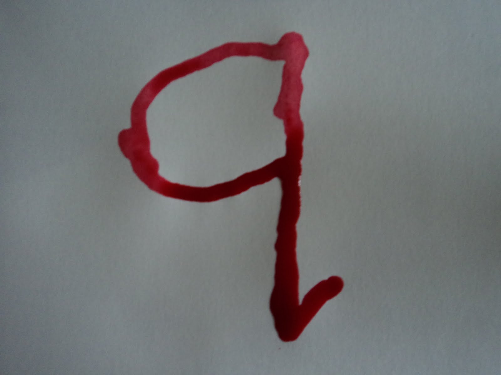
After researching some ink-work, I decided to try some in the Alphabet Soup project. I started simply, by using a straw to mark out a simple letter 'q'. Using the same straw, I blew the lines away from the shape to produce an aggressive, rebellious letterform. It relates to 'shake' by producing the fear that would make someone nervous, uneasy. Although the letterform itself isn't shaking, it is capable of making it happen.