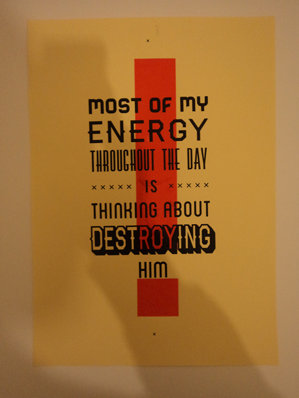
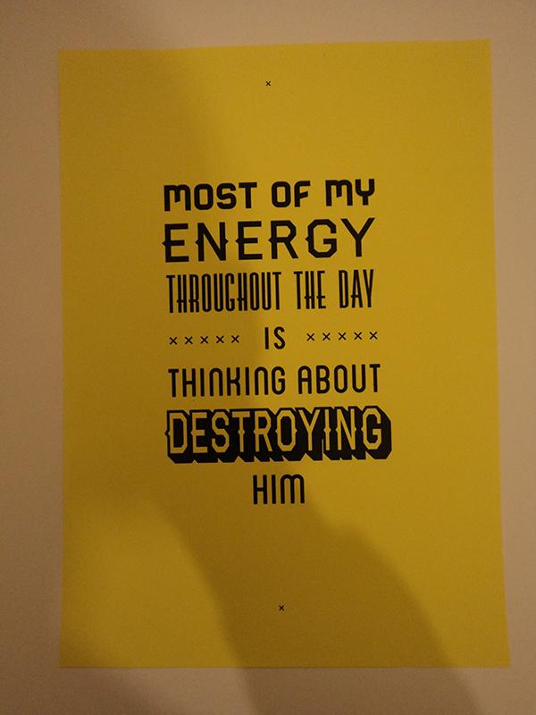
My hate screen prints have come out really well, I used two colours this time to emphasise the emotion. I printed on a range of stocks that would represent a wanted poster, and newsprint to mix it up a little. I think the brown sugar paper is the most successful, along with the red exclamation mark, as it reflects the wanted poster look and allows the black to sit nicely on the stock - whilst printing the red vibrant.
Wednesday, 5 December 2012
'Hate' Screenprints
Super League Teams - Layout Development 2
Super League Teams - Layout Development
Tuesday, 4 December 2012
Applying the Vectors to a Template
Monday, 3 December 2012
Typeface for the Final Crit
Simplifying The Playing Field
---
The diagram here is a good example of the playing field of Rugby League. Here is my version that stays consistent with the development that I have done already.
Sunday, 2 December 2012
Team Distribution Development
I wanted to communicate where the Super League is played, through a simple vector diagram,
This is where Mike's sessions come in handy: tabbing data to get it precise and considered.
Subscribe to:
Posts (Atom)